10 UI Design Trends Dominating 2026 (With Examples)
Discover the hottest UI design trends shaping websites and apps in 2026. From bento grids to AI-powered interfaces, see what's working right now.
Introduction
Design trends come and go. Remember when every website had a giant hero image with text overlay? Or when everyone was obsessed with flat design?
But here's the thing — staying updated with design trends isn't about blindly following the crowd. It's about understanding what's resonating with users right now and why.
2025 is bringing some exciting shifts in UI design. Some trends from last year have matured, some have died, and a few completely new ones have emerged. After analyzing hundreds of award-winning websites and apps, here are the 10 UI design trends that are actually dominating this year.
Let's dive in.
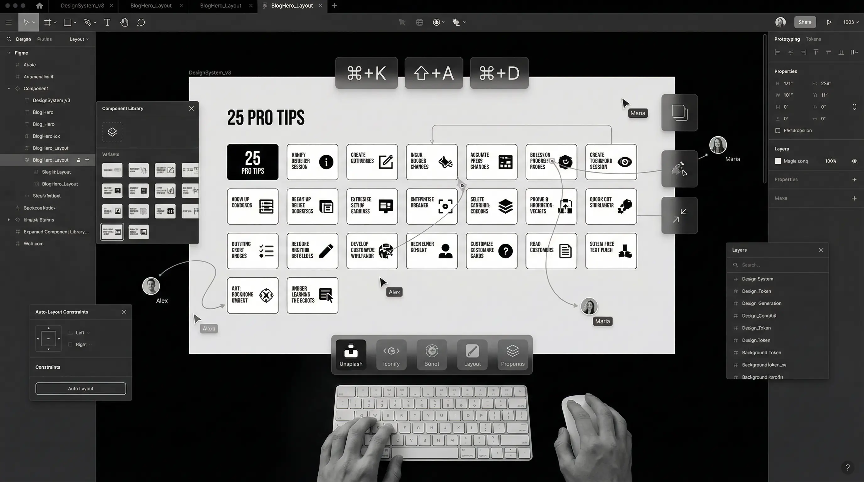
1. Bento Grid Layouts
If there's one trend that exploded in 2024 and is still going strong, it's the bento grid. Inspired by Japanese bento boxes, this layout style uses asymmetrical grids to create visually interesting compositions.
Apple popularized this with their product pages, and now everyone from startups to Fortune 500 companies is using it.
Why It Works
- Visual hierarchy comes naturally — Different sized boxes draw attention to what matters
- Perfect for showcasing features — Each "box" can highlight a different aspect
- Mobile-friendly — Boxes stack beautifully on smaller screens
- Breaks the boring grid monotony — More interesting than uniform columns
You'll see bento grids on landing pages, dashboards, portfolio sites, and even e-commerce. It's versatile and engaging when done right.
Don't overdo it. A bento grid works best when you have 4-8 distinct items to showcase. More than that, and it becomes chaotic.
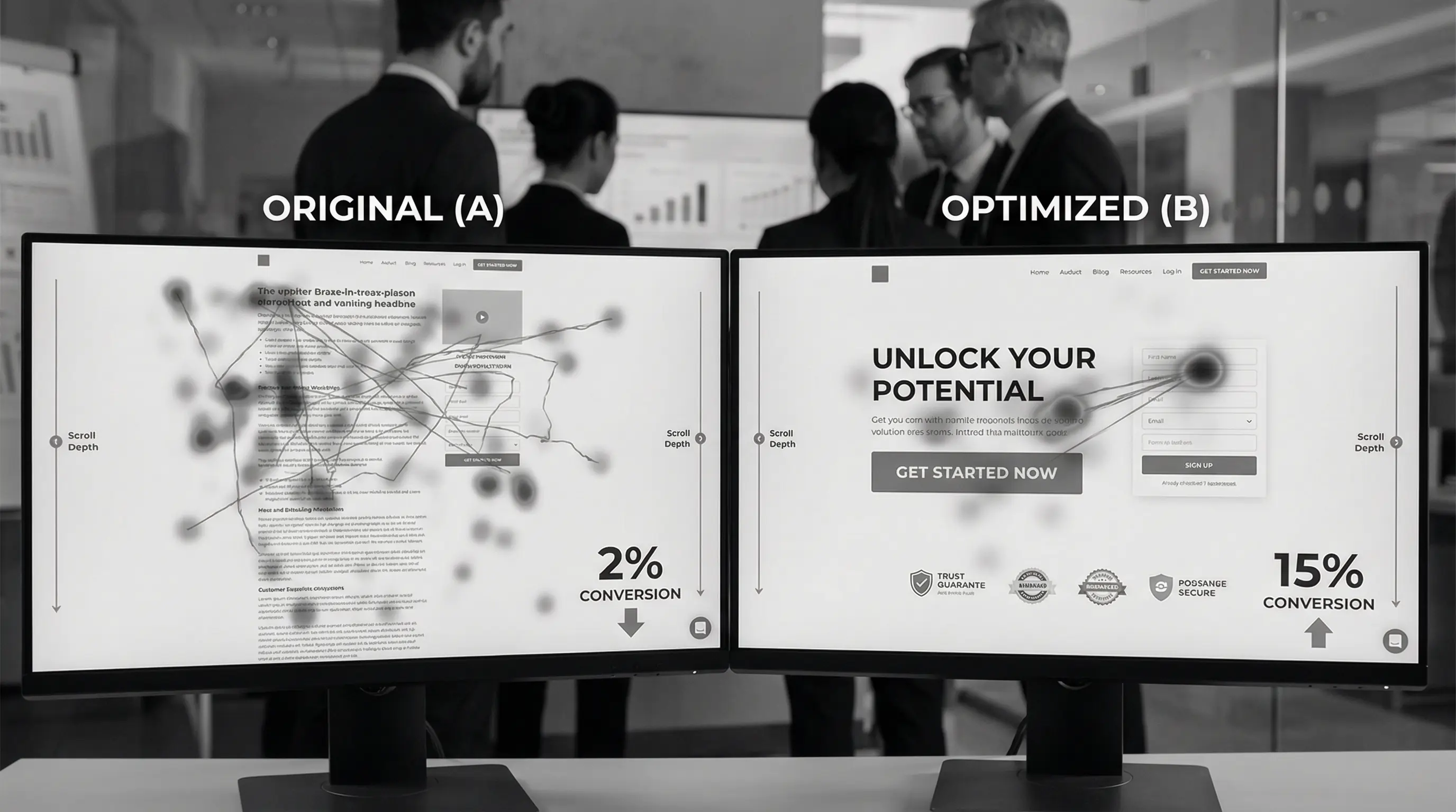
2. AI-Powered Personalized Interfaces
This is the biggest shift happening right now. Interfaces that adapt to individual users in real-time.
Think Netflix's homepage that's completely different for each user. Or Spotify's Discover Weekly. That's AI personalization — and it's moving beyond streaming platforms into regular websites and apps.
What This Looks Like in 2025
- Dynamic content blocks — Homepage sections that change based on user behavior
- Personalized navigation — Menus that highlight what you use most
- Smart defaults — Forms that pre-fill based on past interactions
- Contextual UI — Interfaces that adapt to time of day, location, or device
E-commerce sites are leading this trend. If you've browsed sneakers, the homepage reshuffles to show you more sneakers. The UI literally morphs around your preferences.
This isn't just cool — it significantly boosts conversion rates. Users see what's relevant to them, not generic content.
3. Glassmorphism 2.0
Remember when glassmorphism first appeared? Frosted glass effects were everywhere, often overdone and hard to read.
In 2025, glassmorphism has matured. Designers have learned how to use it tastefully — subtle blur effects, better contrast, improved accessibility.
The New Rules
- Subtle is key — Light blur, not heavy frosted effects
- High contrast text — Readability comes first
- Strategic use — For cards and overlays, not entire backgrounds
- Combined with solid elements — Glass elements alongside opaque ones
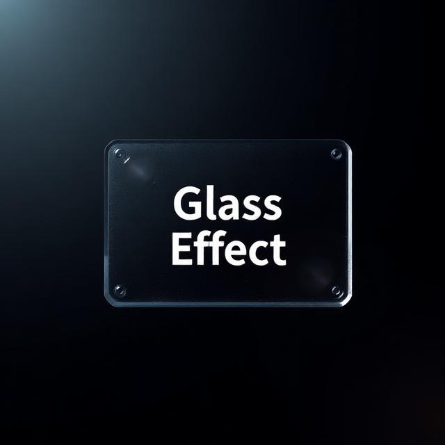 Glassmorphism in 2025 — subtle, readable, and purposeful
Apple's visionOS has pushed this trend forward with their spatial computing interface. The glass aesthetic feels futuristic without sacrificing usability.
4. Dark Mode as the Default
Dark mode is no longer a "nice to have" — it's expected. But here's what's changed: many sites are now launching with dark mode as the default, with light mode as the alternative.
Why the shift?
- Easier on eyes — Especially at night or in low-light environments
- Battery savings — Significant on OLED screens
- Premium feel — Dark interfaces often feel more modern and sleek
- Better for visual content — Images and videos pop against dark backgrounds
Tech products, creative portfolios, and SaaS dashboards are leading this shift. If your audience is tech-savvy or uses your product during evening hours, dark mode default makes sense.
If you implement dark mode, don't just invert colors. Pure black (#000000) on screens is harsh. Use dark grays (#121212 or similar) for a softer, more comfortable experience.
5. Micro-Interactions Everywhere
Those tiny animations when you hover over a button, toggle a switch, or complete an action? They're called micro-interactions, and they're becoming more sophisticated in 2025.
Micro-interactions serve multiple purposes:
- Feedback — Confirming that an action was registered
- Guidance — Showing what's clickable or interactive
- Delight — Adding personality and polish to the experience
- State communication — Showing loading, success, or error states
What's New in 2025
We're seeing more complex, physics-based animations. Elements that bounce, stretch, and respond like real objects. Buttons that "press down" when clicked. Cards that tilt slightly on hover. Toggle switches that have satisfying motion.
Framer Motion and GSAP have made implementing these animations easier than ever. But remember — restraint matters. Every animation should have a purpose, not just exist for the sake of being flashy.
6. Bold, Expressive Typography
2025 is the year of typography making a statement. Giant headlines. Unusual font pairings. Text as a design element itself.
We're seeing:
- Oversized headlines — Taking up 50%+ of the screen
- Variable fonts — Single font files that adapt to screen size and weight
- Kinetic typography — Text that animates and moves
- Mixed weights and styles — Bold meets light, serif meets sans-serif
- Broken grid text — Headlines that span across unconventional layouts
 Bold typography doing the heavy lifting — no hero image needed
Brands like Apple, Stripe, and Linear use typography masterfully. Sometimes the font IS the design. No fancy graphics needed when your text makes the statement.
Check out fonts like Space Grotesk, Cabinet Grotesk, Clash Display, and Satoshi. They're modern, versatile, and many are free for commercial use.
7. 3D Elements (But Make Them Subtle)
3D on the web has matured. We're past the "throw a spinning 3D logo on everything" phase. In 2025, 3D elements are being used more thoughtfully.
How 3D is Being Used Now
- Hero illustrations — 3D product renders and abstract shapes
- Interactive product showcases — Rotate and explore products in 3D
- Subtle depth elements — 3D icons and small decorative objects
- Scroll-triggered animations — 3D objects that react to scrolling
The key difference? Performance optimization. Libraries like Three.js and Spline have made it possible to add 3D without killing page load times. But you still need to be careful — test on lower-end devices too.
Apple's product pages remain the gold standard here. Their 3D iPhone renders are smooth even on older devices because they're heavily optimized.
8. Accessibility-First Design
This isn't just a trend — it's becoming a requirement. More countries are implementing web accessibility laws, and brands are finally taking WCAG guidelines seriously.
But here's what's changed: accessibility is no longer an afterthought. Designers are building it in from day one.
What Accessibility-First Looks Like
- Color contrast checking — Built into the design process, not an audit later
- Keyboard navigation — Everything usable without a mouse
- Screen reader optimization — Proper heading structure, alt texts, ARIA labels
- Motion preferences — Respecting "reduce motion" settings
- Focus states — Clear visual indicators for keyboard users
Tools like Stark (Figma plugin), axe DevTools, and built-in accessibility checkers in browsers make this easier than ever.
Beyond legal compliance, accessible design reaches more users. An estimated 15% of the global population has some form of disability. That's a huge audience you could be excluding with poor accessibility.
9. Brutalism and Anti-Design
Not everything has to be polished and pretty. Brutalist design — raw, unpolished, intentionally "ugly" — is having a moment.
This trend pushes back against the sameness of modern web design. Every startup site looks the same: clean sans-serif font, pastel colors, rounded corners, soft shadows. Brutalism says "forget the rules."
Brutalist Design Characteristics
- Bold, harsh typography — Often monospaced or unusual fonts
- High contrast — Black and white, or clashing colors
- Visible borders and grids — No soft, invisible containers
- Raw, unpolished elements — Intentionally basic HTML-looking elements
- Breaking conventions — Unexpected layouts and interactions
This isn't for everyone. It works best for creative agencies, art portfolios, experimental projects, and brands that want to stand out by being different. A corporate bank website? Probably not.
10. Sustainable and Eco-Conscious Design
This is a trend that reflects larger societal shifts. Designers are thinking about the environmental impact of their work.
Every page load uses energy. Servers consume electricity. Data transfer has a carbon footprint. Sustainable design aims to minimize this.
Sustainable Design Practices
- Optimized images and assets — Smaller file sizes, modern formats like WebP and AVIF
- Efficient code — Less JavaScript, faster loading
- Dark mode — Reduces energy on OLED screens
- Reduced autoplay — Videos only play when users choose
- Green hosting — Choosing hosts that use renewable energy
- Content strategy — Only building what's actually needed
Websites like Organic Basics and Wholegrain Digital have embraced this, even showing carbon footprint information to users.
It's not just good for the planet — it often results in faster, more user-friendly websites too. Win-win.
Trends to Be Careful With
Not every trend is worth following. Here are some that are either dying or need caution:
- Neumorphism — The soft, embossed look that was hot in 2020. It has accessibility issues and is fading out.
- Overly complex animations — Cool but often hurt performance and usability.
- AI-generated imagery — It's everywhere, and users are starting to recognize and distrust it.
- Infinite scroll without end — Users want to know when content ends. Footer matters.
- Bento grids are everywhere — perfect for showcasing features and creating visual interest
- AI-powered personalization is moving from tech giants to regular websites
- Glassmorphism has matured — subtle and readable is the new rule
- Dark mode is now the default for many products, not just an option
- Micro-interactions are getting more sophisticated but purposeful
- Bold typography can carry entire designs without fancy graphics
- 3D elements are useful when optimized and subtle
- Accessibility-first is becoming standard practice, not an afterthought
- Brutalism offers an escape from cookie-cutter designs
- Sustainable design is good for the planet AND user experience
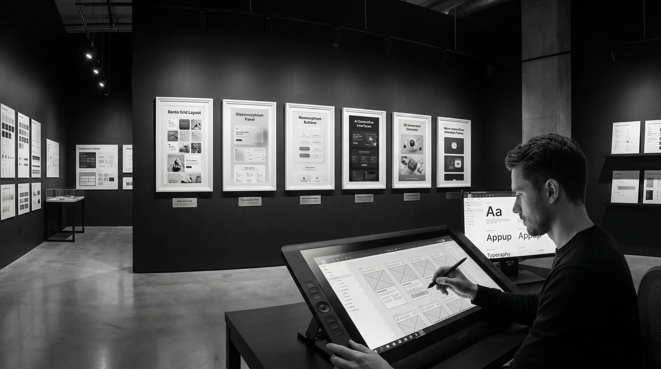
How to Actually Use These Trends
Here's my honest advice after two decades in design:
Don't chase every trend. Pick the ones that make sense for your brand, your audience, and your goals. A law firm doesn't need brutalist design. An eco-conscious brand should probably embrace sustainable design practices.
Trends serve users, not egos. If a trend makes your site harder to use, skip it. Usability always wins over aesthetics.
Combine thoughtfully. The best designs often blend 2-3 trends together. Bento grids with bold typography. Dark mode with subtle glassmorphism. Mix and match strategically.
Test with real users. What looks cool in Dribbble might not work in the real world. Always test your designs with actual users.
Conclusion
2025's design trends reflect a maturing industry. We're moving past gimmicks toward designs that are beautiful AND functional, eye-catching AND accessible, trendy AND sustainable.
The best designers aren't the ones who follow every trend. They're the ones who understand why trends emerge and selectively apply what serves their users.
Use this list as inspiration, not a checklist. Let your brand's needs guide which trends you adopt — and which you skip entirely.
Need a website that looks modern without chasing every trend? At Arcenik Technologies, we design websites that balance visual appeal with user experience and business goals.
Let's talk about your project — we'll help you figure out which design direction makes sense for your brand.