Landing Page Design Best Practices: Convert More Visitors in 2026
Design landing pages that convert. Psychology, layout, copywriting, and real examples of high-converting pages.
Introduction
Your landing page gets 5,000 visitors a month. Only 50 convert.
That's a 1% conversion rate. Meanwhile, your competitor with a "worse" product converts at 8%. They're getting 400 conversions from the same traffic.
The difference? Not their product. Not their pricing. Their landing page.
A great landing page isn't about flashy animations or fancy graphics. It's about understanding human psychology, removing friction, and guiding visitors toward one clear action.
I've designed and analyzed hundreds of landing pages — from startup MVPs to enterprise campaigns. I've seen pages with 50%+ conversion rates and pages that convert at 0.2%. The difference comes down to specific, repeatable principles.
This guide will show you exactly what makes landing pages convert in 2026. Not theory from textbooks, but battle-tested practices from real campaigns spending real money.
Let's turn your traffic into customers.
What is a Landing Page? (And What It Isn't)
First, let's clear up confusion:
Landing page: Single page with one goal (sign up, buy, download). No navigation. No distractions. Just one clear path forward.
Homepage: Entry point to your website. Multiple goals, navigation menu, lots of options.
Don't confuse them. A homepage educates and explores. A landing page converts.
Types of Landing Pages
- Lead generation: Collect emails/contact info
- Click-through: Warm up before purchase (pre-order pages)
- Sales: Direct purchase right there
- Squeeze: Minimal info for free resource download
- Event registration: Webinar, workshop sign-ups
Each type needs different elements, but core principles stay the same.
Show your landing page to someone for 5 seconds. Then ask: "What was it about?" and "What could you do there?" If they can't answer clearly, your page fails. Clarity beats cleverness.
The Anatomy of a High-Converting Landing Page
Every successful landing page has these elements in this order:
1. Above the Fold (The Make-or-Break Section)
Hero Section Must Include:
- Headline: Clear value proposition (not clever tagline)
- Subheadline: Supporting detail
- Visual: Product/service in action
- CTA Button: One clear next step
- Trust signal: Customer count, awards, logos
Visitors decide in 3-5 seconds whether to stay or bounce. Win them here or lose them forever.
2. Social Proof
Humans trust other humans more than companies. Show:
- Customer testimonials (with photos and names)
- Number of users/customers
- Brand logos (if working with known companies)
- Ratings and reviews
- Case study highlights
Place throughout page, not just one section.
3. Benefits (Not Features)
People don't buy products — they buy better versions of themselves.
Bad: "Our CRM has advanced analytics"
Good: "See which leads are ready to buy right now"
Bad: "256GB storage"
Good: "Store 50,000 photos without deleting memories"
Features tell. Benefits sell.
4. How It Works
Three simple steps showing the process:
- Sign up in 60 seconds
- Connect your tools automatically
- Start seeing results today
Remove mystery. Show the path.
5. Objection Handling
Address concerns before they arise:
- "Is it secure?" → SSL badge, security certifications
- "Is it expensive?" → Money-back guarantee
- "Is it complicated?" → "No credit card required"
- "What if I don't like it?" → Free trial, easy cancellation
6. Final CTA
Repeat your main call-to-action. People need multiple opportunities to convert.
Conversion Optimization Principles
Headline That Converts
Bad headlines:
- "Welcome to Our Platform" (says nothing)
- "Innovation That Matters" (vague)
- "The Future is Here" (cliché)
Good headlines:
- "Create Professional Invoices in 2 Minutes"
- "Sleep Better Tonight — Or Your Money Back"
- "Get Your First 100 Customers Without Ads"
Formula that works:
[Specific Result] in [Timeframe] without [Common Pain Point]
Example: "Build Your Website in 3 Hours Without Writing Code"
CTA Button Psychology
Bad CTAs:
- "Submit" (sounds like work)
- "Click here" (generic)
- "Learn more" (vague)
Good CTAs:
- "Get My Free Guide"
- "Start Free Trial"
- "Show Me How It Works"
- "Yes, I Want This"
CTA Best Practices:
- Use first-person ("Get MY free trial" not "Get YOUR free trial")
- Action-oriented verbs
- Benefit-driven ("Save 10 Hours This Week")
- Create urgency when genuine ("Offer Ends Friday")
- Remove risk ("No Credit Card Required")
Color Psychology
| Color | Psychology | Best For |
|---|---|---|
| Orange | Enthusiasm, action | CTAs, impulse actions |
| Green | Growth, trust, safety | Financial, health products |
| Blue | Trust, professionalism | B2B, corporate |
| Red | Urgency, excitement | Sales, limited offers |
| Purple | Luxury, creativity | Premium products |
| Black | Sophistication, exclusivity | Luxury brands |
But here's the truth: color matters less than contrast. Your CTA must stand out from everything else on the page.
Form Optimization
Every field you add reduces conversions by ~5-10%.
Minimum viable form:
- Email only (best conversion)
- Email + Name (still good)
- Email + Name + Phone (conversion drops)
Only ask what you absolutely need at this stage. You can collect more info later.
Form design tips:
- Labels inside fields (looks cleaner)
- Auto-focus first field
- Show password requirements upfront
- Inline validation (show errors immediately)
- Smart defaults (country based on IP)
- Mobile-optimized input types
Visual Design Principles
White Space is Your Friend
Cramming everything above the fold kills conversions. Space:
- Guides the eye naturally
- Makes content digestible
- Feels premium
- Reduces cognitive load
Apple's landing pages are 70% white space. There's a reason.
Visual Hierarchy
Size, color, and position create hierarchy:
- Headline: Largest text, bold
- Subheadline: Medium, supporting detail
- Body copy: Smallest, provides depth
- CTA: Bright color, stands out
Eye should flow naturally: Headline → Subhead → Visual → CTA
Images That Convert
What works:
- Real product screenshots
- Real customer photos
- People using your product
- Before/after comparisons
- Product in context
What doesn't:
- Generic stock photos
- Smiling business people in suits
- Abstract concepts
- Anything fake-looking
Hero image tip: Show the product interface if it's software. Show the product itself if it's physical. Show the result if it's a service.
Video on Landing Pages
Video can increase conversions by 80%. But only if done right:
- Keep under 90 seconds
- Show value in first 5 seconds
- Captions (80% watch without sound)
- Autoplay muted (controversial but converts)
- Show play button clearly
60-70% of landing page traffic is mobile. Design for mobile first, desktop second. If it doesn't work on a phone, it doesn't work.
Copywriting for Conversion
The AIDA Framework
Structure your copy around:
- Attention: Headline grabs them
- Interest: Subhead and benefits keep them
- Desire: Social proof makes them want it
- Action: CTA tells them what to do
Power Words That Convert
For urgency: Now, Today, Limited, Ending, Last Chance
For value: Free, Proven, Guaranteed, Results, Save
For exclusivity: Exclusive, Secret, Members Only, VIP
For ease: Easy, Simple, Instant, Quick, Effortless
Numbers Work
Specific numbers feel real. Vague claims feel fake.
Bad: "Many customers love us"
Good: "12,847 businesses trust us"
Bad: "Save time"
Good: "Save 4.5 hours every week"
Bad: "Affordable pricing"
Good: "Starting at ₹499/month"
Addressing Pain Points
Great landing pages understand customer pain deeply:
Surface level: "Email is overwhelming"
Deeper level: "Important messages get lost in spam"
Deepest level: "You're afraid you'll miss something career-changing"
Speak to the deepest level you can identify.
Mobile Optimization
Mobile users behave differently. Optimize for:
Thumb-Friendly Design
- CTA buttons at least 44×44px
- Place key actions in thumb zone (bottom third)
- Avoid hamburger menus (no navigation anyway)
- Click-to-call buttons visible
Faster Loading
- Optimize images aggressively
- Minimize animations
- Reduce third-party scripts
- Test on actual phones (not just devtools)
Shorter Forms
Mobile users hate typing. Minimize it:
- Use dropdowns over text inputs
- Enable autocomplete
- Accept Apple/Google Pay
- Social login options
Trust Signals That Actually Work
Social Proof Hierarchy
- Video testimonials: Most powerful, hardest to fake
- Case studies with numbers: "Increased revenue by 340%"
- Photo + name testimonials: Real people, real stories
- Text-only reviews: Better than nothing
- Star ratings: Quick trust indicator
Trust Badges
Place these near form/payment:
- SSL certificate icon
- Payment method logos
- Money-back guarantee
- Security certifications
- "As featured in" media logos
Transparency Builds Trust
- Show real team photos
- Display pricing clearly (no "Contact for pricing")
- Link to privacy policy
- Physical address if applicable
- Response time expectations
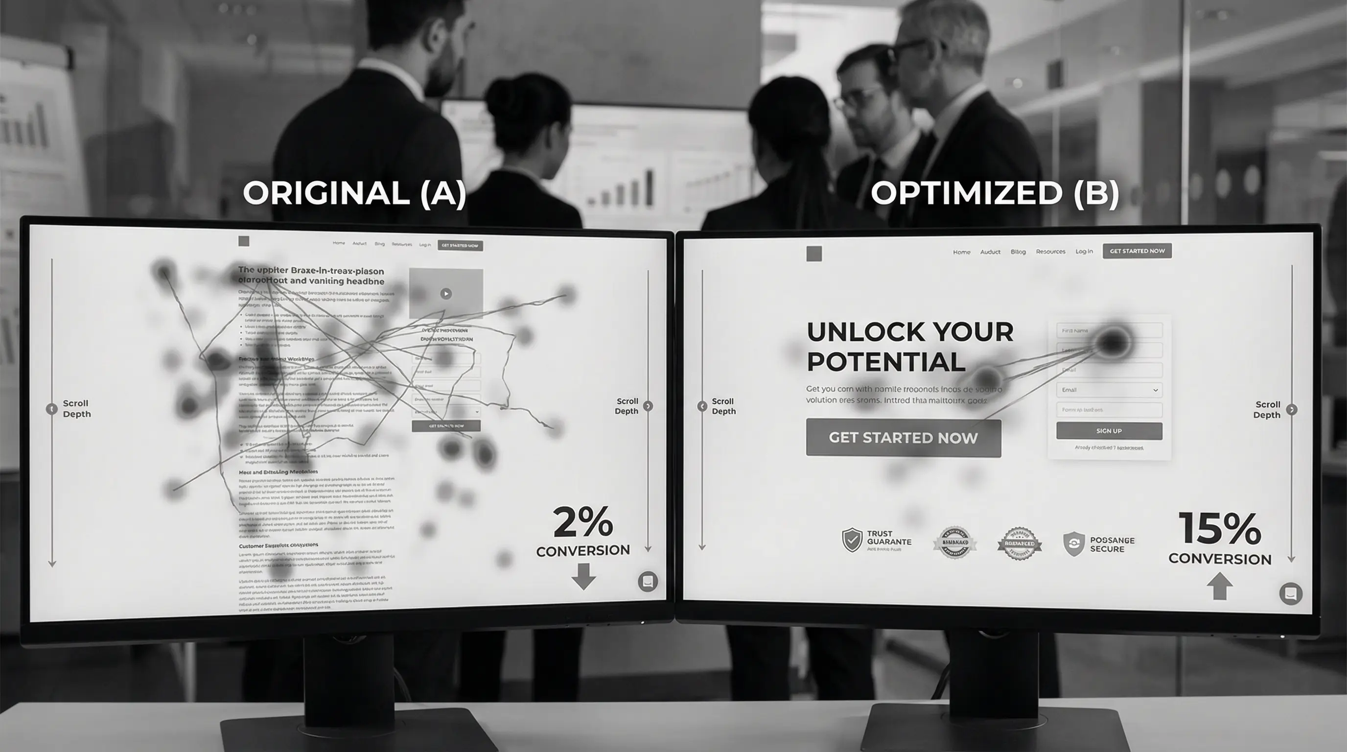
A/B Testing Your Landing Page
What to Test (In Order of Impact)
- Headline: Biggest conversion driver
- CTA copy: Simple change, big impact
- Hero image: Visual matters
- Form length: Fewer fields often win
- Social proof placement: Test positions
- Price presentation: ₹99/month vs ₹1188/year
- Color: Test last, matters least
Testing Tools
- Google Optimize: Free, integrates with Analytics
- VWO: Visual editor, easy tests
- Optimizely: Enterprise-grade
- Unbounce: Landing page builder with testing
Testing Best Practices
- Test one element at a time
- Run until statistical significance
- Need 1000+ conversions for reliable data
- Document everything
- Apply learnings to other pages
Common Landing Page Mistakes
- Too many CTAs — One page, one goal
- No clear value prop — "What's in it for me?" unclear
- Asking too much too soon — 15 form fields for a whitepaper
- Generic stock photos — Fake people kill trust
- Slow loading — Lost conversions before page loads
- No mobile optimization — 70% of traffic ignored
- Vague headlines — Clever ≠ Clear
- No social proof — "Why should I trust you?"
- Hidden pricing — Transparency wins
- Navigation menu — Gives escape routes
- One goal only — multiple CTAs kill conversion
- Clear headline — specific value in 5 seconds
- Benefits over features — "what's in it for me" wins
- Social proof throughout — real testimonials with photos
- Minimal form fields — every field costs conversions
- Mobile-first design — 70% of traffic is mobile
- Fast loading essential — every second costs money
- Specific numbers — vague claims feel fake
- Remove navigation — no escape routes
- A/B test everything — assumptions lose to data
Landing Page Checklist
Before launching, verify:
Above the Fold:
- ☐ Clear headline with specific value
- ☐ Supporting subheadline
- ☐ Relevant hero image/video
- ☐ One prominent CTA button
- ☐ Trust signal visible
Content:
- ☐ Benefits clearly stated
- ☐ Social proof included
- ☐ 3-step "How it works"
- ☐ Objections addressed
- ☐ Second CTA at bottom
Technical:
- ☐ Mobile responsive
- ☐ Loads under 3 seconds
- ☐ Forms working properly
- ☐ Analytics tracking set up
- ☐ Thank you page ready
Copy:
- ☐ No jargon or buzzwords
- ☐ Specific numbers used
- ☐ Active voice throughout
- ☐ CTA copy action-oriented
- ☐ Grammar/spelling perfect
Conclusion
Landing pages are sales conversations in digital form. Every element either moves visitors toward conversion or away from it. There's no neutral ground.
Start with clarity. What's the one thing you want visitors to do? Build everything around that single goal. Remove distractions, address objections, build trust, and make the next step obvious.
Don't aim for perfection on launch. Aim for good enough to test. Then improve based on real data, not opinions.
The landing pages that convert at 20%+ aren't magic. They're just relentlessly optimized based on testing what actually works with real users spending real money.
Your landing page is either making you money or costing you opportunities. There's no in-between.
Now go make yours convert.
Need a landing page that actually converts?
At Arcenik Technologies, we design and optimize landing pages that turn traffic into customers. From strategy to design to A/B testing, we handle everything.
Get a free landing page audit — we'll show you exactly what's killing your conversions and how to fix it.